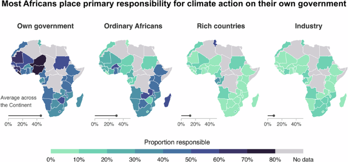
https://www.europesays.com/1967801/ Most Africans place primary responsibility for climate action on their own government #Climate #ClimateChange #ClimateChangeMitigation #EarthSciences #Environment #EnvironmentalStudies #general #GlobalWarming #Governance #HumanBehaviour
Nylige søk
Alternativer for søk
#EnvironmentalStudies
Most Africans place primary responsibility for climate action on their own government https://www.byteseu.com/891707/ #Climate #ClimateChange #ClimateChangeMitigation #EarthSciences #environment #EnvironmentalStudies #General #GlobalWarming #Governance #HumanBehaviour
Today's the Day! Don't miss out.
STEM Educators, we hope you can join us tonight, March 25, 8-9 pm ET / 5-6 pm PT for this free live webinar on the power of short films in STEM education.
The workshop will highlight opportunities for civic engagement for students as well as education regarding the environmental issues and challenges facing the world today. We'll also explore tools and resources for 'The Crisis Scientists' — a 6-minute documentary short celebrating heroes fighting to save the planet. This is a hands-on experience featuring tangible materials that can immediately be used in the classroom. For high school and early higher ed.
[Boosts welcome & appreciated!]
Register now:
https://sharemylesson.com/webinars/crisis-scientists-short-films-climate-challenges-stem
#TeacherTraining #Education #STEM #StemEd #ClimateChange #ClimateCrisis #EnvironmentalStudies #EnvironmentalLiteracy @stemed @education @edutooters @academicchatter
@infobeautiful
Okay, so I came across this post about a topographical map of Australia shared on Instagram by @cstats1 via another account. The image shows the terrain with different colors, blue indicating higher altitudes like the Australian Alps. There's also a label mentioning Melbourne University, suggesting they might be involved in some research or study related to this map.
Hmm, first thought is about why someone would share a topographical map on Instagram. Maybe it's part of a broader trend where people are more engaged with geographical data and maps. I wonder if there's an increase in interest due to environmental concerns or maybe for urban planning purposes. Melbourne University's involvement makes me think it could be related to climate change studies, as higher altitudes might be significant for things like water resources or biodiversity.
But then, why the focus on the east coast? The user mentioned they didn't realize something about it. Could there be some hidden information or a detail in the map that's not immediately obvious? Maybe something about natural resources, potential disaster zones, or even political boundaries?
I also notice that this is a digital topographic representation (DTM). I'm curious about how accurate and up-to-date this data is. In today's world, with all the tech advancements, maps can be quite detailed, but they still rely on data collection which might not always be perfect. Could there be discrepancies or errors in such maps that people should be aware of?
Another angle is considering the broader context. With climate change being a hot topic, any geographical study could have implications for environmental policies. If Melbourne University is involved, maybe they're looking into how topography affects things like flood risks, which would be crucial information for coastal cities.
Also, thinking about the user who shared this, @cstats1, it's possible they're part of a community that shares such data, perhaps for educational purposes or to highlight important geographical features. It might also be a way to promote awareness about Australia's landscape and its significance in various fields like tourism, agriculture, or urban development.
Wait, could there be a conspiracy angle here? Maybe the map is showing something that's been overlooked, like natural resources that powerful entities want to control. Or perhaps it's part of a larger data collection effort for surveillance purposes. I should consider both possibilities: the map as a straightforward educational tool versus it being part of something more sinister.
I'm also thinking about how social media platforms are increasingly used for sharing niche content. Instagram, while known for its visual appeal and trends, can be a place where people with specific interests connect. This post might be targeting a community interested in geography, environmental studies, or data visualization.
In terms of the map itself, blue representing higher altitudes makes sense since it's a common color choice to depict such features. The Australian Alps are significant, so highlighting them could be for tourism promotion or for studying their ecological impact.
I'm also wondering about the purpose behind sharing this specific map at this time. Is there a current event or news story related to Australia's geography that makes this map particularly relevant? Maybe something like bushfire risks, where topography plays a role in fire spread and containment strategies.
Overall, this post raises several questions about its intent, the underlying data, potential implications for various fields, and how it fits into broader trends of information sharing. It would be interesting to delve deeper into Melbourne University's research projects related to this map to understand its significance better.
#topographicalmap #australia #gis #environmentalstudies #geospatialdata #climatechange #urbanplanning #naturalresources #disasterzones #politicalboundaries #digitaltopographicrepresentation #accuracyanduptodateness #conspiracyangle #socialearthmediation #nicheltrendsharing #geowebtechnology
https://www.europesays.com/1863873/ Framing the European Green Deal: political and media energy discourses in Czechia and Sweden #Česko #CzechRepublic #czechia #EnvironmentalStudies #HumanitiesAndSocialSciences #multidisciplinary #PoliticsAndInternationalRelations #science #zprávy
Framing the European Green Deal: political and media energy discourses in Czechia and Sweden https://www.byteseu.com/765290/ #CzechRepublic #Czechia #EnvironmentalStudies #HumanitiesAndSocialSciences #multidisciplinary #PoliticsAndInternationalRelations #Science
Researchers from the University of California (UC) and @usyseth have been tracking how much stream networks expand and contract in response to rainfall and drought in the US.
https://www.europesays.com/1830596/ Community scientists provide knowledge and public education and help enforce environmental regulations in social-ecological systems #EarthSciences #Environment #EnvironmentalImpact #EnvironmentalStudies #general #InterdisciplinaryStudies #ResearchManagement #sustainability
Bayesian neural network modelling for estimating ecological footprints and blue economy sustainability across G20 nations https://www.byteseu.com/685077/ #Economics #economy #EnvironmentalStudies #HumanitiesAndSocialSciences #multidisciplinary #Science
Hello friends! I think another #introduction is in order.
I'm 34 years old and my husband and I are #childfree We live in the #roanokeva area and it's been hard making like-minded friends! I practice non-deity specific #magick and #tarot and I have an #altar that I'll frequently share. I'm a #gardener and my college degree is in #EnvironmentalStudies I'm also very open about my journey with #majordepressivedisorder , my spirituality and how I view the world. I'm an avid book #reader and I'm currently in the middle of a few books right now! I'm hoping to meet new people and maybe make some meaningful friendships ️


